Data Discovery Dashboards
In Varicent® Varicent ICM, you can use Data Discovery Dashboards to analyze data and share insights.
Using Data Discovery Dashboards, you can explore data by creating dashboards. Dashboards contain visualizations like graphs, charts, maps, and many other visual representations of data. Dashboards that you create can be shared with web users. For more information about the dashboard experience for web users, see the Data Discovery Dashboards web tab topics.
You can use these main components to create dashboards:
Data sources
Tables
Calculations
Data stores
Visualizations
Widgets
At a high level, these steps describe how to create a dashboard:
Add a data source to the dashboard.
Add a visualization to the dashboard.
Add widgets to enhance the dashboard.
Share the dashboard with web users.
Get started with Data Discovery Dashboards
Use Data Discovery Dashboards to explore data by creating and sharing visualizations.
Creating a dashboard
Create a dashboard to begin exploring your data.
From the Reports module, click and then choose .
Type a name for your dashboard and then click .
Choose one of the following types of dashboards:
Option
Description
Tabbed
A multi-page dashboard.
Tip
To create a single-page report, select the Tabbed option and only use a single tab.
Infographic
A one page dashboard with a vertical layout optimized for mobile devices.
Select a layout template from the list.
Click OK.
Now, you can start adding data sources, visualizations, and widgets to build out your dashboard.
Sharing a dashboard
Share dashboards and infographics on either the desktop or mobile Sales Portal by using the Portal Access module.
For more information about setting access to web tabs, see the Portal Access Module topics.
In Portal Access, on the Web Tabs tab, click the Add Web Tab icon.
Tip
To add a web tab to an existing folder, select the folder before you click the Add Web Tab icon.
In the Name field, type a name for the web tab. You can use special characters, such as hyphens and apostrophes.
From the Type list, select one of the following types:
Data Discovery Dashboard
Data Discovery Infographic
From the Object list, select the object that is assigned to the web tab.
Click Add Web Tab.
Important
The first tab that is listed in Portal Access is the first tab that is displayed on the Sales Portal.
Data sources
Data sources are one of the building blocks of dashboard creation.
After you add a data source, you can begin exploring it in a dashboard.
Adding a data source to a dashboard
Explore data in Data Discovery Dashboards by adding a data source.
In the Sources pane
 , click the add icon
  .
.Use the search bar or expand the data source menus to select a data source.
Choose a filter by selecting one of these options:
Web User - users can access only their own data in the data source. Select the column that contains the payee ID.
None - no filter is applied and users can see all the data in the data source.
Click OK.
The data source is now available in the Sources pane.
You can add more sources or you can begin exploring your data in the dashboard.
Viewing the underlying data
View all the rows and columns in a data source by using the data tray.
Click the data tray icon
 .
.A table that shows all rows and columns in the data source appears.
Optional: Click the sort icon
 to sort the data in ascending or descending order.
Removing a data source
Remove a data source from a dashboard.
Important
A data source cannot be removed if it is being used by a dashboard.
In the Sources pane, hover over the data source you want to remove.
Click the more options menu (…) beside the source and select Remove.
Changing data aggregation
Change how numeric data is summarized or aggregated.
You can change how data from a data source is summarized or aggregated. When you add a data source, a default aggregation is applied to the numeric columns in that data source. For example, a column titled "Revenue" is aggregated by sum. If the title is not recognized, no aggregation is applied.
In the Sources pane, select the data source that you want to change.
Hover over the name of the column you want to change.
Click the more options menu (…) beside the column and select Properties.
From the Aggregate menu, select one of the following options:
Average: the average value of the column.
Count: the number of rows that are in the columns.
Count Distinct: the number of unique rows that are in the column.
Maximum: the highest value in the column.
Minimum: the lowest value in the column.
Total: the total value of the column.
Click Close.
Creating navigation paths
Create navigation paths in your data sources so dashboard users can drill through levels of data.
You can add a navigation path to an existing data source in your dashboard. See: Adding a data source to a dashboard.
If a visualization has a navigation path, a web user can drill through levels of data based on the data source's columns. For example, you can create a navigation path with columns for year, month, quarter, and week.
Columns from different tables can be added to a navigation path. The same column can be added to multiple navigation paths. A data module can have multiple navigation paths.
In the Sources pane, select the data source that you want to add a navigation path to.
Select one or more columns from the list in the data source.
Tip
Use Ctrl + click or Shift + click to select multiple columns.
Click Create navigation path...
From this window, you can make these edits:
Drag columns from the data source into the editor pane to add them to the navigation path.
Click the remove icon
 to remove a column from the navigation path.
Drag columns up and down to change their order.
Rename the navigation path.
Click OK.
When you create a visualization with the data source you added the navigation path to, users can drill through the data.
Web users can now right-click on a visualization and select the drill-down icon  to explore subsequent items.
Data points
After you add a data point to a dashboard, you can interact with the data directly on the dashboard.
You can interact with data points in the following ways:
Hover over a data point. A tooltip appears that shows you information about the data point.
Click the data point. The data point is highlighted across all visualizations that use it in the current tab.
Right-click on the data point. A tooltip appears that shows you information about the data point. You can also perform actions on it, like applying filters.
Visualizations
Visualizations are one of the building blocks of dashboard creation.
You can use visualizations to explore relationships and trends and clarify your data.
You can explore your data in different ways by creating visualizations. You can also change the visualization type after you add it to a dashboard.
Important
Each visualization must use data from a single data source. You cannot use data from multiple data sources in the same visualization.
Creating visualizations
Add a visualization to a dashboard.
Before you can add a visualization to your dashboard, you must add at least one data source.
If you want Data Discovery Dashboards to suggest a visualization type for you, complete the following steps:
In the Sources pane, select the data source that you want to use.
A list of columns in the data set appears.
Drag a column onto the canvas.
If you want to create a specific type of visualization, complete the following steps:
In the Visualizations tab, drag a visualization onto the canvas.
The visualization wizard appears.
Add a column from the Sources tab to each required field.
Formatting visualizations
You can format your visualizations from the canvas.
Select the visualization you want to format from the canvas.
From the toolbar, click Properties
 .
.In the Visualization pane, depending on the visualization type, you can format the color palette, axes, and titles.
In the General pane, you can format the visualization's position and size in the canvas.
Changing the visualization type
Change the type of visualization after it is added to a dashboard.
Select the visualization that you want to work with.
Click the Change visualization icon
 in the toolbar.
Select the visualization type that you want to use.
If you select a visualization type that requires different data slots to be used, add a column to each empty data slot that has an asterisk (*) next to it.
Changing the data displayed in a visualization
Change the data that appears in a visualization.
Select the visualization you want to change the data in.
In the Sources pane, select the data source that you want to use in the visualization.
Drag a column from the Sources pane into a column field in Fields menu
 .
.The column from the Sources pane replaces the column currently in the visualization.
Optional: To remove a column, click the more options menu (…) and select Remove column.
Limiting data by high or low values in a visualization
Limit the data in your visualization to focus on the data that is most important.
You can limit the data in a visualization to display only the top or bottom values of a data source. For example, you can display the top 10 or bottom performing sales people. You can limit data by either a number or a percentage.
If the selected data set contains a filter, the limit is applied after the filter is applied.
Select the visualization you want to limit the data in.
Open the Fields menu
in the toolbar.Click the more options menu (...) beside the column you want to apply a limit to, and click Top or bottom.
Select whether to limit data by Top count, Top %, Bottom count, or Bottom %.
Optional: In the By field, specify a column that you want to use as a filter.
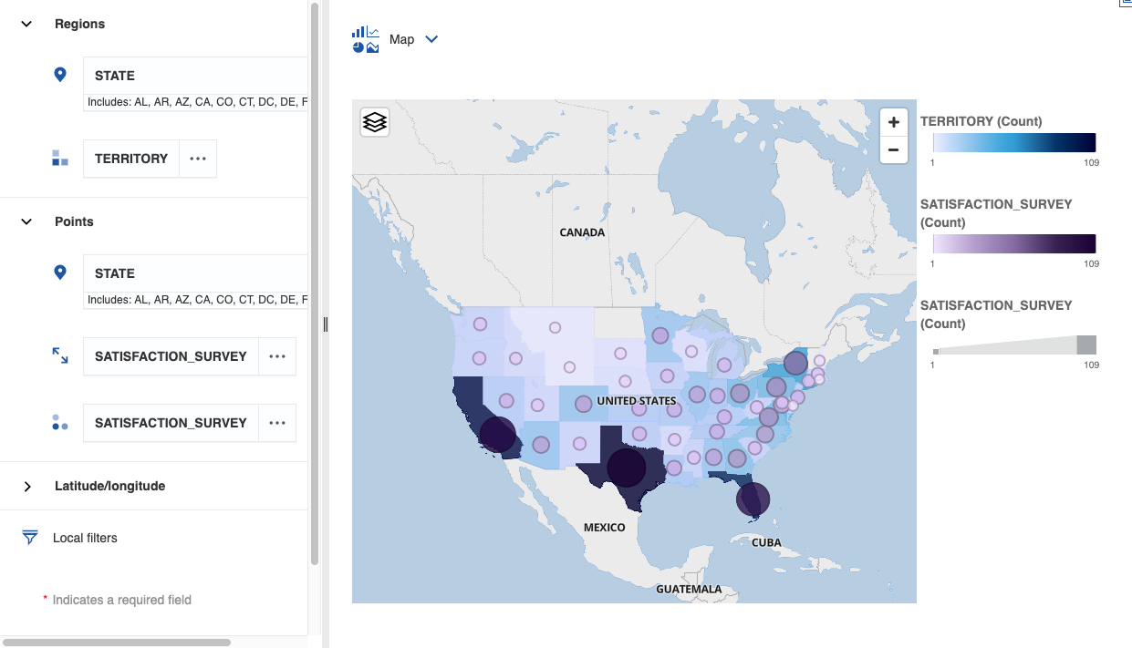
Maps
You can use maps in Data Discovery Dashboards to help you analyze data based on geographical areas.
Data is mapped by matching the location name on the map with a location in your data. You can use locations like states, regions, and postal codes to visualize data.
Important
Dashboards have a limit of plotting or mapping a maximum of 3000 data points on a single visualization.
Adding a map to a dashboard
To use a map in a Data Discovery Dashboard, you must have a data source with valid geographic information such as states, regions, or postal codes. For more information about adding data sources, see: Adding a data source to a dashboard.
When you use a map in a dashboard, you can show data for one location measure as a filled region, a point, or both.
In the Visualizations pane, drag a Map onto the dashboard.
In the Sources tab, expand the data source that you want to use.
If you want to visualize your data by region, follow these steps:
Drag a column that contains location data into the Locations field under Regions.
Drag another column into the Location color field to emphasize that data.
If you want to visualize your data as points on the map, follow these steps:
Drag a column that contains location data into the Locations field under Points.
Drag another column into the Point size field to emphasize that data by size.
Drag another column into the Point color field to emphasize the data by color.
If you want to visualize your data by latitude and longitude, follow these steps:
Important
The format for longitude and latitude must be numbers and decimals, such as
51.4769, 0.0005.Drag a column that contains latitude coordinates into the Latitude field under Latitude/longitude.
Drag a column that contains longitude coordinates into the Longitude field under Latitude/longitude.
Drag another column into the Label field to add labels to the map.
Drag another column into the Point size field to emphasize that data by size.
Drag another column into the Point color field to emphasize the data by color.
In this map, you can see the number of territories in a state by the color of the region. The points on each region show the average customer satisfaction by the size and color of the point (a large, dark-colored point means high satisfaction).
Filters
Use filters to focus on one area of your data.
Filtering data in a visualization
Filter data in a dashboard to exclude data points from a visualization.
If you want to keep or exclude some data points, complete the following steps:
Right-click or Ctrl+click the data point that you want to exclude. You can select data points in the visualization, on the legend, or in the axis.
To show only the selected data points, click the Keep icon.

All other data points are excluded from the visualization.
To hide the selected data points, click the Exclude icon.

If you want to filter the data in one or more columns, complete the following steps:
Click the Open data tray icon
in the toolbar.Click a column heading in the data tray and click Filter.
Specify the values that you want to filter on.
Tip
If you want to select many values, select the values that you do not want to include and then click Invert.
Click OK.
If you want to define a filter condition or filter a column in a visualization, complete the following steps:
Click the visualization you want to filter in the canvas.
Drag the column that you want to filter by into the Local filters field.
Specify the values that you want to filter on.
Tip
If you want to select many values, select the values that you do not want to include and then click Invert.
Click OK.
Filtering data in the current tab
Filter data that appears in a visualization in the current tab.
You can add a filter to the All tabs filter and to the This tab filter in a dashboard to filter down further on the same measure.
For example, add the Year column to both filters. You filter All tabs to show 2015, 2016, and 2017. The This tab filter shows only these years and you can filter the years further.
In the Sources pane, expand the data source.
Drag one or more columns into the This tab filter area.
You can change the order of the columns by dragging and dropping.
Select the name of the column in the This tab filter area.
Specify the values that you want to filter on.
Tip
If you want to select many values, select the values that you do not want to include and then click Invert.
Click OK.
Filtering data in all tabs
Filter data that appears in a visualization across all tabs in a dashboard.
You can add a filter to the All tabs filter and to the This tab filter in a dashboard to filter down further on the same measure.
For example, add the Year column to both filters. You filter All tabs to show 2015, 2016, and 2017. The This tab filter shows only these years and you can filter the years further.
In the Sources pane, expand the data source.
Drag one or more columns into the All tabs filter area.
You can change the order of the columns by dragging and dropping.
Select the name of the column in the All tabs filter area.
Specify the values that you want to filter on.
Tip
If you want to select many values, select the values that you do not want to include and then click Invert.
Click OK.
Calculations
In addition to bringing in calculations that are created in Composer as a data source, you can create calculations in a dashboard based on the columns in a table.
Creating simple calculations
Create a simple calculation based on table columns and add it to your dashboard as a visualization.
In the Sources pane, expand the data source that you want to use.
Hover over the column that you want to base the calculation on, click the more options menu (...) and then click Create calculation.
To create an advanced calculation, click Use calculation editor.
In the Name field, type a name for the calculation.
Under Expression, choose an operator.
You can use the following operations: addition (+), subtraction (-), multiplication (x), division (/), percentage (%), or percentage change (% change).
In the Constant field, enter a number.
Click OK.
Creating advanced calculations with the expression editor
Create an advanced calculation with the expression editor to define your own expression.
Tip
If you need more help with the expression editor, read the Cognos Analytics documentation: Using the expression editor.
In the Sources pane, expand the data source that you want to use.
Hover over the column that you want to base the calculation on, click the more options menu (...), and then click Create calculation.
Click Use calculation editor.
In the Name field, type a name for the calculation.
In the Expression field, define the expression for the calculation.
Begin typing the name of the function you want to use and select the function from the list of suggested functions.
Drag a table column into the Expression field to add it to your expression.
Click the Validate icon
 to check that the expression is valid.
After successful validation, click OK.
Widgets
Use widgets to enhance your dashboards with text, images, shapes and other types of media.
Adding text
Add text to your dashboard.
Adding text can reinforce your analysis. For example, you can highlight important points in a visualization or provide background information.
Click the Widgets icon
 to open the Widgets pane.
Drag the Text icon
 onto the canvas.
If you change the size of the display box, the text size changes to fit the box.
Adding images and shapes
Embed images or add shapes to your dashboard.
Click the Widgets icon
to open the Widgets pane.To add an image, complete the following steps:
Drag the Image icon
 onto the canvas.
Paste the URL of the image and press Enter.
Only the following image formats are accepted: JPEG, JPG, GIF, and PNG.
To add a shape, drag the shape that you want to use onto the canvas.
Adding web pages
Embed a web page on your dashboard.
Click the Widgets icon
to open the Widgets pane.Drag the Webpage icon
 onto the canvas.
Paste the URL of the web page and press Enter.
The URL must be in HTTPS format.
Note
If the web page does not display, confirm that the target website allows other applications to embed their web pages.
Adding audio and video
Embed an audio or video file on your dashboard.
Click the Widgets icon
to open the Widgets pane.Drag the Media icon
 onto the canvas.
Paste the URL of the audio or video file and press Enter.
The URL must be in HTTPS format, and must be in one of these image formats:
YouTube URLs
MP4
MP3
AAC
M4A