Presenter Adaptive
In Varicent Incentive Compensation Management (ICM), use Presenter Adaptive to create flexible reports for any device.
To compose and access Presenter Adaptive reports, begin at the Reports module.
Creating a Presenter Adaptive report
You can create a Presenter Adaptive report through the Reports module in the Varicent ICM sidebar.
Tip
Don't see the Presenter Adaptive option? These reports are available only on the newest version of Sales Portal. If you're using Payee Web Classic, contact Support for more information on how to upgrade and take advantage of these features.
In the module, click and select .
Add a report name.
Note
You can save your report only after you add a report name.
To add objects to your report, click the
 icon on the sidebar. Select the object that you want to add and drop it onto the report canvas. You can resize the object from the canvas.
You can add these objects:
Text
You can add both static text and dynamic values to the same text object. Dynamic values includes values like the current web user name or any stored values you've added to the report.
You can also choose from different available fonts, format the text style and change alignment of the text object. By checking the Hide tile option, the background of the object becomes transparent.
Image
You can upload an image or use the current web user's uploaded profile picture by selecting Use current web user image.
Table
You can add a table by adding a data source under the Data tab. From this tab, you can format the data and table and add filters and links. For more information about filters, read: Adding filters to a Presenter Adaptive report.
Charts
You can add charts to enhance your reports. For more information about charts, read: Presenter Adaptive charts.
Pick list
You can add a pick list by adding a data source under the Data tab. From this tab, you can format the data and pick list and add filters. For more information about filters, read: Adding filters to a Presenter Adaptive report.
To build and view the report with actual data instead of placeholder data, complete the following steps:
Click on the
 icon and turn on the Source data toggle.
Select a web user to populate the report with their data, and click Apply.
For more customization options, click on the
icon. From here, you can:Upload a background image
Set preferences for PDF downloads and specify PDF settings
Set general style preferences
Manage chart palettes
Assign a workflow to the report
There are three views for your Presenter Adaptive report:
Desktop
Tablet
Mobile
Each view can be formatted differently, so make sure to set the layout for desktop, tablet, and mobile separately.
For help with publishing and sharing your report, read: Sharing and publishing Presenter Adaptive reports.
Caution
If you're creating reports with a lot of data, you could encounter errors. Pick list selections are limited to 10,000 rows. Publishing large tables is also limited at 10,000 rows and could lead to timeout errors.
In the reports landing page, you can see thumbnail previews of all your reports. You can mark specific reports as a favorite by clicking on the star icon. Under the starred column, you can easily go back to reports that you use most often.
Adding charts to a Presenter Adaptive report
Add visualizations to enhance your Presenter Adaptive report.
Click the
button to open the object menu. Drag and drop a object onto the canvas.Drag the corner of the chart on the canvas to resize it.
In the tab, select a chart type and a data source. Choose the columns you want to use for the x and y axis.
Under settings, you can choose how the object renders if there is no data to show. The Show object with no data option will have objects with no data render as empty. The Hide object with no data option hides the object and other objects in the report shift up to fill the space. The Show placeholder with no data option gives the user a "There is no data to display" message.
In the tab, you can change how your chart looks.
In the tab, you can apply filters. Basic filters allow you to filter out data based on a value in a column. Advanced filters allow you to filter out data based on complex rules. For more information on filters, read: Adding Filters to a Presenter Adaptive report.
Adding value labels to charts
You can add value labels to your Presenter Adaptive charts and customize how they appear on your chart.
To add value labels:
Select a chart from the report canvas.
Go to the Style tab and navigate to the Value labels section.
The Value format drop-down field has different value format types that you can choose from:
Percentage
Number
Currency
Custom
Select the desired value format type. Each selection gives you the capability to choose from additional options to customize how the value labels appear on your chart.
Check the thousands separator option to customize which character will be used to separate thousands.
Designing your Presenter Adaptive reports
Use the color palettes in Presenter Adaptive to customize your reports to meet your business needs. You can choose from out-of-the-box palettes or create your own to match your company colors.
To add a color palette to a chart:
From the canvas in Presenter Adaptive, select the chart you would like to add a color palette to.
In the Style tab, click Colors → Palettes.
Note
If you have already chosen a default color palette, it will automatically be selected.
Choose from one of the out-of-the-box Qualitative, Divergent, or Sequential color palettes.
To create a custom palette click .
Type a palette name and select either Qualitative, Divergent, or Sequential from the Palette type menu.
Click to add more colors to the palette. You can add up to 10 colors to each palette.
Click on the color picker or type a hex code to change the colors in the palette.
Note
You can also quickly manage the color palettes for your reports by going to Report options → Manage Palettes.
Setting a color palette as the default
You can set a color palette as the default palette for the charts in your report. When setting a new default palette, you can choose to apply it to just the current report or all Presenter Adaptive reports.
To set a custom color palette as the default, from the Add palette menu, click the Set as default toggle.
To set one of the pre-installed color palettes as the default, click the more options menu (…) → Edit palette. From here, click the Set as default toggle.
When you set a color palette as the default, you can also choose to apply that color palette as the default for your whole model so that any charts using the old default palette will automatically update to use the new palette.. To do this, select the Apply to all charts using a default palette checkbox.
Presenter Adaptive charts
You can add a variety of different charts to enhance your Presenter Adaptive report.
Chart | Description | When to use? | Compatible palettes |
|---|---|---|---|
Column chart 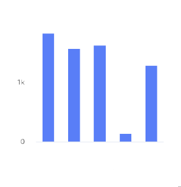 | A column chart shows data represented by vertical rectangular bars. The length of the rectangle is proportional to the value it represents. | Use this chart to show the relative value of different grouped categories or to show ranked values. | Qualitative, divergent, and sequential. |
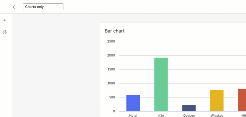
Bar chart 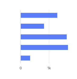 | A bar chart shows data represented by horizontal rectangular bars. The length of the rectangle is proportional to the value it represents. | Use this chart to show the relative value of different grouped categories or to show ranked values. | Qualitative, divergent, and sequential. |
Line chart 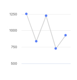 | A line chart shows information as a series of data points connected by a line. | Use when you want to show magnitude or change over time. | Qualitative. |
Pie chart 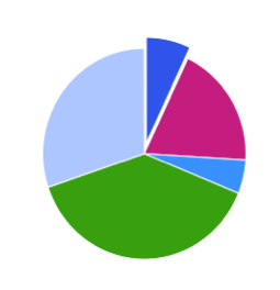 | A pie chart shows proportions of values in a data set. | Use when you want to show how the proportion of different groupings relate to one another. | Qualitative. |
Donut chart 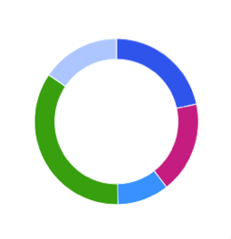 | A donut chart shows proportions of values in a data set. | Use when you want to show how the proportion of different groupings relate to one another. | Qualitative. |
Scatter plot 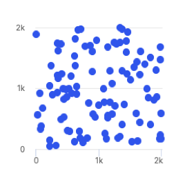 | A scatter plot uses coordinates to show values for two or more variables in a data set. Each point represents one value. The position on the horizontal and vertical axis are determined by two variables. | Use when you want to show correlation between two variables. Use caution when showing correlation - remember, correlation does not equal causation. Good for exploring relationships rather than drawing conclusions. | Qualitative, divergent, and sequential. |
Treemap  | A treemap helps you find patterns in your data by providing a hierarchical view of your data. | Use when you want to compare proportions within the hierarchy. | Divergent and sequential. |
Dumbbell chart 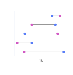 | A dumbbell chart shows the change between two data points using circles and lines. | Use when you want to display the change and distance between two data points. | Not compatible with palettes, but you can customize the displayed colors. |
Simple gauge chart 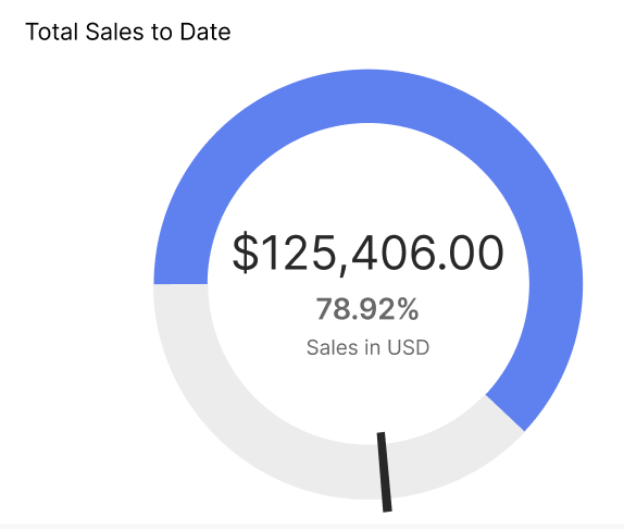 | A simple gauge chart uses a dedicated dial with different colours and a needle pointing to a numeric value from a minimum to a maximum. With this chart, you can easily visualize linear progressive data on the colour-coded dial and see the change in values using the scale. | Use to depict sales performance by representing targets and if they've been achieved. | Not compatible with palettes, but you can customize the displayed colors. |
Activity gauge  | An activity gauge shows whether values fall within an acceptable range by having multiple panes circle around a center point. | Use when you want to show where data points fall within a range. | Qualitative. |
Heat map chart 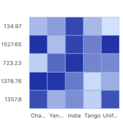 | A heat map uses color to show how a variable is clustered or occurs most frequently. | Use when you want to reveal patterns or show the concentration of events. | Divergent and sequential. |
Bubble chart 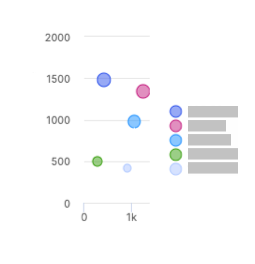 | A bubble chart shows three dimensions of data. Each bubble represents a data point with 3 variables. Variable 1 and variable 2 determines the bubble's location on the horizontal and vertical axis. Variable 3 determines the bubble's size. | Use when you want to show magnitude. | Qualitative. |
Waterfall chart 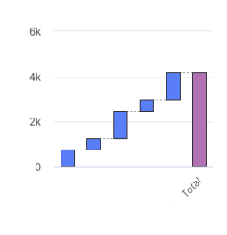 | A waterfall chart shows an initial value and final value with floating intermediate values that affect the initial value positively or negatively. | A waterfall chart can help you understand cumulative effects of values. | Not compatible with palettes, but you can customize the displayed colors. |
Clustered column chart 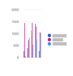 | A clustered column chart represents two fields from the same source for the same value in clustered vertical columns. | Use when you want to compare multiple series of data. | Qualitative, divergent, and sequential. |
Multiple lines chart 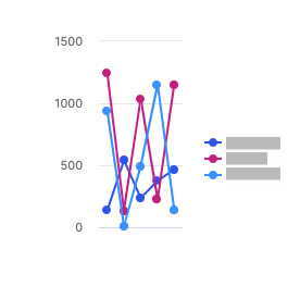 | A multiple lines chart uses multiple lines to show the correlation between data from the same source. | Use to show the relationship between data from the same source. | Qualitative. |
Bullet chart 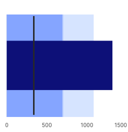 | A bullet chart is a variation of a bar graph that can be used as an alternative to gauges and meters. | Use to compare the performance of a value to other values. | Not compatible with palettes, but you can customize the displayed colors. |
Stacked column chart 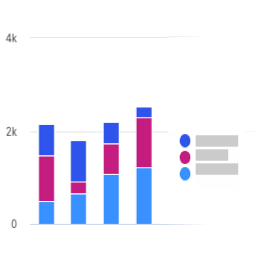 | A stacked column chart shows data represented by vertical rectangular bars with comparative values stacked on top of each other. Each group is represented by two or more vertical bars. The length of the rectangle is proportional to the value it represents. | Use this chart to show the relative value of different grouped categories or to show ranked values. | Qualitative and sequential. |
100% stacked column chart 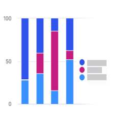 | A 100% stacked column chart shows the relative percentage of multiple data sets in stacked columns, where the total of the stacked columns equals 100%. | Use this chart to show how parts of the data relates to the whole data set. | Qualitative and sequential. |
Stacked bar chart 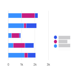 | A stacked bar chart shows data represented by horizontal rectangular bars with comparative values stacked on top of each other. The length of the rectangle is proportional to the value it represents. Each group is represented by two or more horizontal bars. | Use this chart to show the relative value of different grouped categories or to show ranked values. | Qualitative and sequential. |
100% stacked bar chart 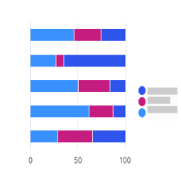 | A 100% stacked bar chart shows the relative percentage of multiple data sets in stacked bars, where the total of the stacked bar equals 100%. | Use this chart to show how parts of the data relates to the whole data set. | Qualitative and sequential. |
Clustered bar chart  | A clustered bar chart shows more than one data set in clustered horizontal columns. | Use when you want to compare multiple data sets in a given category. | Qualitative, divergent, and sequential. |
Area chart  | An area chart is similar to a line chart, but with shaded areas between the line and the axis. | Use when you want to show magnitude or change over time. | Qualitative. |
Stacked area chart  | A stacked area chart is a type of area chart that shows connected data points with comparative values stacked on top of each other. This chart shows a starting set of values, and then uses shading to show values above the starting values. | Use when you want to show the total value of some data broken down by sub-groups. | Qualitative. |
Multiple area chart  | A multiple area chart is a type of area chart that shows connected data points where each data point is compared to the same baseline value. Since data points will sometimes overlap in a multiple area chart, you will see some transparency in the shading so that all the lines can be easily seen. The data point with the most visible color is the largest value. | Use when you want to compare data points across the same baseline. | Qualitative. |
Multiple scatter chart 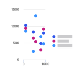 | A multiple scatter chart is similar to a scatter plot chart, but uses multiple data sets instead of a singular data set. | Use this chart to compare how multiple data sets intersect values on each axis. | Qualitative and sequential. |
Line and column chart 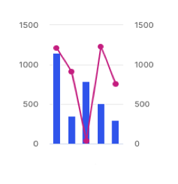 | A line and column chart combines a line chart and a column chart. Both the line and column charts will share an x-axis, but each has its own y-axis. | Use to display two data sets together when the ranges between the two greatly vary. | Qualitative. |
Lines and columns chart 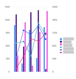 | A lines and columns chart uses multiple bars and lines to show different data sets through the use of multiple y-axes, where each series has a separate axis. | Use when you want to compare and analyze trends in a single visualization. | Qualitative. |
Radar chart 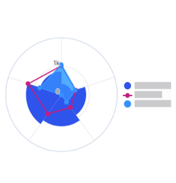 | A radar chart shows 3 or more variables represented on an axis starting from the same point. | Use this chart to show how qualitative data points compare to one another. | Qualitative. |
KPI chart 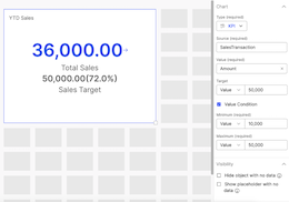 | A KPI chart displays key values with customizable visualizations and styling options. | Use this chart to track progress towards a numeric goal. | None. Default colors are available for the user to change. |
Adding tables to a Presenter Adaptive report
Add tables to your report for a different way to view your data.
Click the
button to open the menu. Drag and drop a object onto the canvas.Drag the corner of the table on the canvas to resize it.
From the tab, select the data source for your chart. Choose the columns that you want to display in the table. Configure the sort order of how you want to display the columns.
Under settings, you can choose how the object renders if there is no data to show. The Show object with no data option will have objects with no data render as empty. The Hide object with no data option hides the object and other objects in the report shift up to fill the space. The Show placeholder with no data option gives the user a "There is no data to display" message.
From the tab, you can change how your table looks.
From the tab, you can apply filters to the data in your table.
Basic filters allow you to filter out data based on a value in a column. Advanced filters allow you to filter out data based on complex rules. For more information on filters, read: Adding filters to a Presenter Adaptive report.
Adding links to a table in your Presenter Adaptive report
To add links to one or more columns in the table:
From the Data tab, click the more options menu (...) next to the column you want to add a link to.
Click , and select or under .
To link to a web address, select if the web address is a secure or a non-secure URL.
If you want to insert a variable in the URL, place your cursor in the URL where you want to insert the value and select a value from the menu. In the text box, enter the URL. Click .
To link to a report, select either or and select the report you want to add.
If a report has more than one assigned web tab, select a web tab and add any necessary parameters. Click .
Aggregating table values in your Presenter Adaptive report
Change how numeric data is aggregated in the table.
Note
Aggregating data disables column edits.
From the Data tab, under Row Groups, select a column to group table row data by. You can add multiple row groups.
Drag and drop the selected columns to change the hierarchy of row groups.
Under Values, select a column to aggregate its values. You can aggregate multiple columns.
A default aggregate function is applied, and a row total displays at the bottom of the table.
Next to the aggregated value, click the more options menu (...).
Select one of the following aggregate functions:
Sum: the total value of the column.
Average: the average value of the column.
Count: the number of rows that are in the columns.
Maximum: the highest value in the column.
Minimum: the lowest value in the column.
From the Style tab, under Values, you can change how the row total looks:
Type a title.
From the Style drop-down menu, select Custom and edit as needed.
To hide the row total, select the Hide row total checkbox.
Adding calculated columns to tables in your Presenter Adaptive report
Create calculations in your tables using a combination of table elements, operators, formulas, and numbers.
Drag and drop a table object into the canvas.
Select a Source with a numeric value and add Columns.
Click Save.
Click on the
button.Add a name, create a formula using the various components available (operators, functions, and sources), select the value format, number of decimal places, display units, and decide whether you want to use the thousands separator.
Important
Aggregation functions such as average, sum, minimum, and maximum cannot be used for calculated column row groups at this time.
Click Add.
Under the Style tab, you can change the styling and formatting of the columns.
Tip
Conditional formatting cannot be applied for calculated columns at this time.
You'll notice that the added calculation is now one of the columns on the data grid. From the Data tab, you can drag and drop to rearrange the order of how the columns are displayed on the table.
Note
You have the option to hide, add links, edit the calculation, rename, and delete the calculation column by clicking on the more options menu (...) of the calculation.
Click Save.
Default custom sort columns in tables
Customize the order of how the data in a column is displayed in tables for an Admin or Payee. You can set the default order and sort one or more columns in an ascending or descending order. This enables you to quickly visualize and analyze your data.
Drag and drop a table object into the canvas.
Select a Source and the Columns you want to show.
Under the Default sort header, select Configure sort order.
Select the column you want to sort and the order in which it will be sorted.
Note
To sort additional columns or to identify the sort order of two or more columns that have the same values, click the + Add sort button (which can be found in the Configure sort order tab) and arrange the sort order.
Click Save.
In the Sales Portal, you can see that the data table has now sorted the columns in the order you indicated. The numbers beside the column names serve as an index and indicate the order of how the columns are sorted.
Tip
In the Sales Portal, you can add another column to sort by clicking and holding the Shift key on the header of a specific column. To go back to how the columns were originally sorted in the Admin page, click refresh.
Adding conditional formatting to a Presenter Adaptive table
Change how values are formatted in a table.
From the tab, under , click .
Choose whether to apply conditional formatting to the table header or to the table values.
Select the columns where you want to apply conditional formatting.
Click .
Type a formula to define the condition under which you want a value to render.
Or use the , , and menus to define your formula.
Tip
If you are applying conditional formatting to a table header, you must aggregate the source in your formula.
Click .
Define how the cell should appear if the condition is met by changing the font style, cell colors, or how the value is displayed.
Click .
If you want to edit a condition, from the tab, under , click the more options menu (...) and then click .
Adding filters to a Presenter Adaptive report
You can add filters to your report to control what data is available for web users. You can add filters to tables, charts, and pick lists.
Select the object you want to filter.
Select the Filter tab.
Click .
Adding a basic filter
A basic filter controls which data users can see based on a value in a column you select.
Select from the menu.
Select the column that contains the values you want to filter on.
Select whether you want to filter by or .
If you are filtering by , select the values you want to filter on.
If you are filtering by , create a rule by selecting an operator and a value. You can also select a global value like the web user ID (the user currently logged in) or the current date.
Tip
You can add one additional rule to basic filters. For more complex filters with 3 or more rules, use an advanced filter instead.
Adding an advanced filter
Advanced filters allow for a more customized interaction with your data.
Select from the menu.
Type a description for your filter.
Tip
A detailed description can help you remember the purpose of your filter. This is useful if you have many complex filters in the same report.
Select the first filter rule by selecting a source column, an operator, and a value. You can also select a global value like the web user ID (the user currently logged in) or the current date.
Click the
 button to add another rule or group.
When you add a group, it adds a sub-level underneath the first group. You can then select or to change the operation type.
You can drag and drop your rules and group to reorder the operations.
Adding values to a Presenter Adaptive report
Add values to your report to show additional data or to scale back the results of a data source to a single cell.
Click on the
 icon, and click .
Add a name for the value and select the data source. Select the column that contains the values you want to display.
Set the ID column values. The number of values you have to set depends on the number of key columns in the source table.
Click .
To edit a value, click on the ellipses beside the value's name. Click after editing.
Composer table editing in Presenter Adaptive
In , you can allow users to submit new data or make edits to tables. For example, you can enable users to correct missing or incorrect data on one or more columns in a table. You can also allow users to submit new rows to a table. Only one user can edit a table at a given time. Enabling column edit also disable auto-aggregation.
Not all sources can be made editable. Trying to make these sources editable can lead to errors. The source requirements are:
The source cannot be a calculation, data store, or a View table.
The source cannot be effective-dated.
Tip
It is possible to add a source with locked rows to the report and enable column edit but users cannot edit that locked data.
To make columns in a table editable:
Select the table that you want to make editable.
In the Data tab, under Web user options, select the checkbox.
Click .
Select the checkbox for each column you want to make editable.
To add a rule, click and then select the type of rule you want to add.
Tip
Validation rules are used to validate an aggregation of data for the whole table such as a maximum or minimum, average, or sum of all the data. Input rules are used to validate on individual values, like not allowing a value to exceed a certain amount.
Click .
Adding row input forms to a Presenter Adaptive report
Add a row input form to your report to allow web users to submit data in to tables.
Click the
button to open the object menu. Drag and drop a object onto the canvas.Drag the corner of the row input form on the canvas to resize it.
In the tab, select the data source for your row input form. Choose the columns that you want users to be able to submit data for.
To change the input settings, click the more options menu (...) beside the name of the column and click . From here, you can change settings like placeholder and default values.
To add a rule, click and then select the type of rule you want to add.
Tip
Validation rules are used to validate an aggregation of data for the whole table such as a maximum or minimum, average, or sum of all the data. Input rules are used to validate on individual values, like not allowing a value to exceed a certain amount.
In the tab, you can change how your row input form looks.
Adding an image that links to an external page or a report
Click the
button to open the menu. Drag and drop an object onto the canvas.Drag the corner of the image on the canvas to resize it.
On the Style menu, select the image file you want to upload.
Click , and select or under .
To link a web address, select if the web address is a secure (https) or non-secure (http) URL.
If you want to insert a variable in the URL, place your cursor in the URL where you want to insert the value and select a value from the menu. In the text box, enter the URL. Click .
To link a report, select either or and select the report you want to add.
If a report has more than one assigned web tab, select a web tab and add any necessary parameters. Click .
Include a Report name and click .
Linking a text item to a report or a web address
Create a link from a text item to a Presenter Adaptive report, Presenter Structured report, or a web address.
Click the
button to open the menu. Drag and drop a object onto the canvas.Drag the corner of the text box on the canvas to resize it.
Enter the text and highlight the text where you want to create a link towards.
Click on the Add link
 button, and select or under . You have the option to open the link in a new tab. To do so, check Open link in new tab under Options.
To link a web address, select if the web address is a secure (https) or non-secure (http) URL.
If you want to insert a variable in the URL, place your cursor in the URL where you want to insert the value and select a value from the menu. In the text box, enter the URL. Click .
To link a report, select either or and select the report you want to add.
If a report has more than one assigned web tab, select a web tab and add any necessary parameters. Click .
Click .
Duplicating Presenter Adaptive report components
To reduce the time it takes to build reports, we now bring you the ability to duplicate report components.
To duplicate a report component:
Select an exiting component and click on the duplicate
 icon on the bottom left corner.
A duplicate version of the component will be created. The duplicate component will include 'Copy' within it's name - for example, Transaction (Copy).
The duplicate component retains all the styling components of the original including color, font size, conditional formatting, palettes and more.
Place the duplicated component anywhere on the report canvas.
Update the duplicate component as you would an item created using the left panel. You can change source, update styles and tiles and more as you see fit.
Enabling copying a row of a Presenter Adaptive table to an Inquiry
In Presenter Adaptive, you can allow users to map and copy a row on a table to an Inquiry from within a report. For an Inquiry workflow assigned to a report, you will be able to map the columns on the report table to fields of an Inquiry form. When users select a row on the report table, the column values will automatically populate on the mapped Inquiry form fields.
Note
This feature is available to users who have enabled Inquiries. To get started working with Inquiries, please contact Support.
To allow copying a row of a report table to an Inquiry:
Assign a workflow to the report.
In Report Options, under the Inquiry Workflow section, choose a workflow from the list of available workflows.
Note
The list displays only running Inquiry workflows.
Map the table columns to Inquiry form fields.
Select a table on the report
On the Data tab, check the Allow copy row to Inquiry option.
Click the Inquiry form mappings link. You will see mapping options for columns on the table that are marked as visible.
For each column, open the dropdown list to see the Inquiry form fields that you can map the column to.
Note
Once a particular form field has been mapped to a column, you can't use the same form field to map to a different column.
Migrating Presenter Adaptive reports
Migrating Presenter Adaptive reports from one model to another works the same way as other migrations. You can migrate Presenter Adaptive reports as part of your regular migration process or you can migrate them separately.
While logged into the target model (the model you want to migrate to), go to the Model settings page and click .
Select the source model (the model you want to migrate from) and then click .
A list of objects in the model appears.
Select the objects you want to migrate.
Tip
Click to automatically select all items in the source model that an object depends on. For example, if you select a Presenter Adaptive report, when you click , data sources and calendars used by those reports are selected.
You can select the Replace Conflicts checkbox to overwrite objects with the same name in the destination model with those from the source model.
Click .
The Status page shows any issues with the migration. Click the name of the object to get more details on how to resolve the error.
If there are no issues, click .
Sharing and publishing a Presenter Adaptive report
After you create and save your Presenter Adaptive report, you can publish and share it through Portal Access.
Click on the
icon, and under Publish , select the Allow PDF download checkbox. From here, you can also choose how to format the PDF, like whether to add page numbers or a footer and whether the report exports in portrait or landscape mode.Select Web user PDF settings to choose how to format the PDF, like whether to add page numbers or a footer and whether the report exports in portrait or landscape mode.
In Portal Access, under the Web Tabs tab, click the icon.
Type a name for the web tab.
From the menu, select Presenter Adaptive.
Select the Presenter Adaptive report you'd like to add.
Click .
Note
If you haven't already, you must also assign an access tree to the report under the Assignment tab.
Now, users can view and download the report from Sales Portal.
Caution
Publishing reports with large tables is limited to 10,000 rows. Users may encounter timeout errors when trying to publish large reports.